Math Worksheets
How to read and interpret bar charts with kids
By Jobi · Creator & Maintainer, PrintablesWorld · Updated 2026-06-22 · 4 min read
Most children can read a value off a bar chart fairly quickly. Interpreting one, saying what it shows, what it does not, and whether it is misleading, is a considerably later skill, and it is the one that matters. Free printable bar chart reading worksheets practise both.
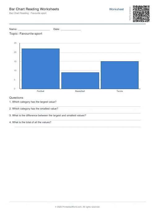
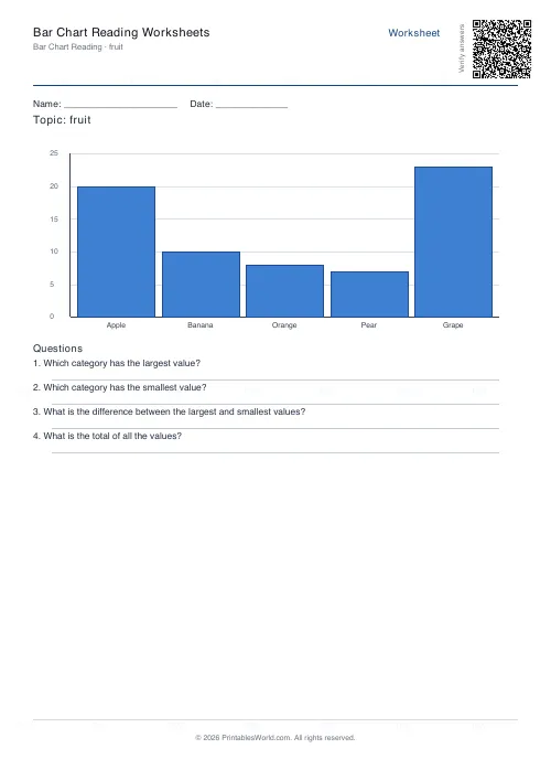
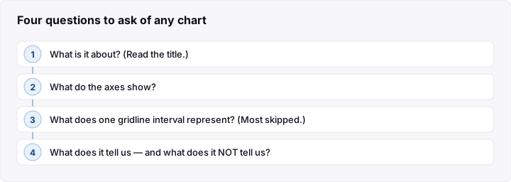
Four questions to ask of any chart
Use the same four every time, in this order, until they become automatic.
- What is it about? Read the title. Children skip straight to the bars, and a chart without its title is just shapes.
- What do the axes show? Categories along one, a scale along the other. What is being counted, and in what units?
- What does one square or gap on the scale represent? The most-skipped question and the source of most errors. A scale going up in fives or twenties is read as ones by a child who has not checked.
- What does it tell us? Biggest, smallest, differences, totals. And then the interesting part: what does it not tell us?
That last half-question is where interpretation starts. A chart of favourite fruits in one class does not tell you what children nationally prefer, and noticing that is a genuine skill.
The axis mistakes to watch for
Reading between gridlines carelessly. If the scale goes up in fives, a bar halfway between 10 and 15 is 12.5 or thereabouts. Many children will say 11 or 13 without noticing they are guessing.
Assuming the scale starts at zero. It often does not, which exaggerates differences. Worth pointing out early, because it is the commonest way a chart misleads.
Confusing frequency with the thing counted. In a chart of pets owned, the bar height is how many children, not how many pets. This confusion is extremely common and worth checking explicitly.
Ignoring the units. Thousands, percentages and pounds all look the same on the axis if you do not read the label.
Start with their own data
A chart made from data a child collected themselves is understood far better than one printed in a book, because they know what each bar means without decoding it.
Easy sources: eye colour in the class, how everyone travels to school, favourite fruit, birthdays by month, weather over a fortnight, minutes spent reading each day.
Have them collect the data with a tally, draw the chart, then answer questions about it. And then, most usefully, swap charts with someone else and answer questions about theirs. Reading a chart you did not make is the actual skill.
Teaching them to spot a misleading chart
This is the payoff, and older primary children take to it with enthusiasm because it feels like catching someone out.
Show two charts of the same data, one with the axis starting at zero, one starting at 90, and ask which makes the difference look bigger. Then ask which is more honest.
Other things to look for: a scale with uneven intervals, bars of different widths, three-dimensional effects that distort the height, and a chart with no title or axis labels at all.
Once children have made a deliberately misleading chart themselves, they rarely read one uncritically again. It is also a genuinely useful piece of media literacy, which is not the usual claim for a data-handling lesson.
Pie charts raise their own questions. Proportions rather than counts, and hard to compare across two charts. Pie chart reading sheets are the natural follow-on once bar charts are secure.
Frequently asked questions
What age do children start bar charts?
Simple pictograms and block graphs usually appear around ages five to seven, with scaled bar charts following in the years after. Curricula vary.
Bar chart or pie chart first?
Bar charts. They show counts directly and compare easily. Pie charts require understanding proportion and are harder to read accurately, so they generally come later.
Should children draw charts by hand or use software?
By hand first. Drawing the axes and choosing a scale is where the understanding is built. Software makes those decisions invisibly.
My child reads values wrongly. What is going wrong?
Usually the scale. Check they can say what one gridline interval represents before looking at any bar. That single question fixes most errors.
Before you print
Use the same four questions every time, insist on the scale question before any value is read, and get children making charts from their own data before interpreting anyone else's. Print bar chart sheets first and move to pie charts once bars are secure.
Related tools
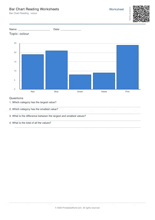
Bar Chart Reading Worksheets
Interpret a bar chart and answer comprehension questions about the data.
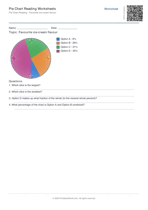
Pie Chart Reading Worksheets
Interpret a pie chart with percentages and answer comprehension questions.
Graph Paper Generator
Create custom graph paper PDFs with square or rectangular grids, dot styles, and axis numbering.
Continue reading
Math Worksheets
Making maths fun: 15 ways to practise without tears
Maths tears are usually about difficulty, length or fear of being wrong, not about maths. Fifteen practical changes, grouped by which of those three problems they actually solve.
6 min read
Math Worksheets
How many maths worksheets per day? A parent's guide
The honest answer is less than most parents assume. And the number of questions matters less than whether the session ends well.
5 min read